A theory: Acid Bath’s song “Scream Of the Butterfly” was inspired by a Grant Morrison character in Doom Patrol (+bonus stuff).

From the damp, wet bayous of Louisiana emerged the legendary sludge/doom metal band Acid Bath. Their frontman, Dax Riggs alternated between haunting witches screams and beautiful clear singing parts, which combined to the filthy sound of the melancholic guitar riffs contributed to this band’s unique sound, think a demon possessed David Bowie mixed with bluesy black metal, maybe?

His lyrical style is an ethereal collage of troubling images, a dark and beautiful macabre poetry evoking serial killers sniffing weird stuff, overdoses and mystical ramblings, and the ghost of Hitler on the radio… Or as he calls it himself : “murder ballads”.
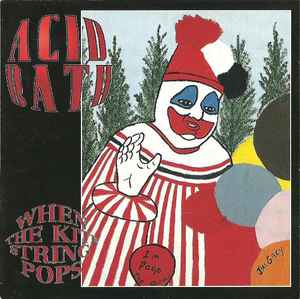
The label choose (against the band’s will*) to use real art from serial killer John Wayne Gacy, aka Pogo The Clown.

*Edit : apparently this is up for debate, you can read the different opinions on the Reddit post here.

Back to our regular program: In Acid Bath‘s first album “When The Kite String Pops“, there is a beautiful ballad indeed, the eerie “The Scream Of The Butterfly“:

So what does this have to do with comics? Hang on, we’re setting the stage, we’re getting there!

So first, let’s establish Dax Riggs‘ love for comics. As he states in this interview, titled “Music Matters: Comic book fantasy inspires Dax Riggs “:

“Superheroes, comic books and the idea of multiple dimensions, alternate earths, that’s all the stuff I love to think about,” he said. “It makes me happy to think about magical things.”

And he was onto the good stuff:

“I was very moved by Alan Moore and Watchmen,” he said before confessing to ownership of every work the English writer has ever published.

Before “Watchmen” was repackaged as a graphic novel in 1987 and named one of Time’s 100 Best English language novels, Riggs bought all 12 issues in the miniseries as they were originally released, off the rack.

Surrounded by his favorite comics of the ’80s, his collection grew to include titles such as “Miracleman,” “Sandman” and Frank Miller fan favorites like “Ronin” and “The Dark Knight Returns.”

So he was onto Alan Moore, Frank Miller, Neil Gaiman… I think it’s safe to assume that he was also onto Grant Morrison then… But for now, let’s first see if those comic’s influences showed up in his work indeed…

On the same album, the song Jezebel contains the line “Our Superman found dead in a telephone booth…” (What a chilling thought by the way…)

After Acid Bath‘s bassist Audie Pitre died in a tragic car accident caused by a drunk driver, the remaining members formed a slower more melodic band: Agents Of Oblivion, and this is the album cover:

Recognize the art?

The artwork is the Hand Of Glory, lifted from Mike Mignola‘s Hellboy story “Box Full Of Evil”:

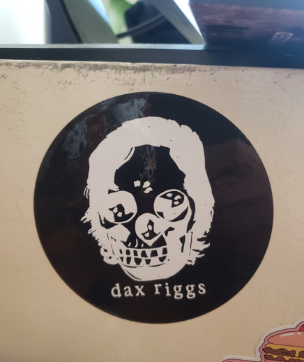
This isn’t the only time Dax Riggs used Mike Mignola‘s art, he produced several stickers lifted from his artwork, like this one for example:
Ok, we have established that Dax Riggs was indeed injecting his love of comics into his lyrics. Back to Grant Morrison, this story called “The Butterfly Collector” was published in 1989:

It features the character Red Jack, who calls himself God and has a collection of pinned butterflies from which he arbours his power:

The butterfly’s suffering fuels Red Jack‘s powers:

In his palace, the background music consists of:

Sounds Familiar?

Acid Bath‘s song “The Scream Of The Butterfly” was released in 1994, it features the lyrics:

“She smiles like a child with flowers in her hair
With blood on her hands into the sun she stares
She feels it die, I heard her cry like the scream of the butterfly

I rest my case.

Since the writing of this article, it has been brought to my attention that the sentence appears in The Doors‘ song “When The Music is over“:

Before I sink Into the big sleep
I want to hear I want to hear
The scream of the butterfly

Which was inspired by a 1966 movie:

So who influenced who? Did the movie influence Morrison (Jim)‘s lyrics, who in turn influenced the comic’s writer Morrison (Grant)‘s who by a strange coincidence shares his last name, who then in turn influenced Dax‘s lyrics?

Bonus stuff : the lyrics from Scream Of The Butterfly also contain the following lines:

Rabbit howls like something old
As we twitch to her lullaby

Which were inspired by the book When Rabbit Howls, written by a recovering abused schizophrenic person as part of her therapy:

And that’s where it gets weird… Because Grant Morrison cited this book as an inspiration for the character Crazy Jane… From Doom Patrol, as documented here:

The bulk of these decisions, both positive and negative, have their roots in a common origin—the source that Morrison cites in Doom Patrol #20 as their inspiration for Crazy Jane, When Rabbit Howls, which Morrison describes, in language that prefigures their objectification of Jane, as “a peek at what reality looks like from the other side.”.

In the same song, you can also find the following lyrics:

“We dropped some acid, killed our parents
Then we hit the road”

Which feels very similar to the line on Sonic Youth‘s 1990 “Goo” cover art by Pettibon:

I also suspect that their song “The Blue” was inspired by a story from Alan Moore‘s mind-blowing incredible run on Swamp Thing : “The Nukeface papers“:

The story features a strange man who wanders around after an incident in a nuclear facility, he goes on rambling drinking some weird stuff, and ends up offering it to a homeless guy in the woods.

The results are quite problematic for the poor fellow… The unsuspecting man ends up slowly dying, and his last words are:

“The Blue”

By the way, his run also features a story called “By Demons Driven!” published in 1984…

Now where did I already saw this sentence again?

Oh that’s right! But that’s another story…

In Peter Bagge‘s “Hate” comic, this is what you can find in issue n°8, published in the spring of 1992:

Acid Bath‘s second and last album Paegan Terrorism Tactics which was released in 1996, opens up with the “Paegan Love Song”:

Which features the famous line:

“You scream, I scream
Everybody screams for morphine”

Now it’s true that the live “I scream, You scream, We all scream for Ice Cream” is pretty well known in American culture , but maybe Dax‘s influence comes from the comic, as the concept feels very similar.

In conlusion: I really encourage everyone to give a listen Acid Bath, they are one of my favorite bands, and their legendary statue is not usurped.

This time the label used some art from Jack Kevorkian aka Dr.Death

They only released two albums : “When The Kite String Pops” and “Paegan Terrorism Tactics“. Even if you’re not into metal, they got some more beautiful ballads apart from “Scream Of The Butterfly” that everyone can get into:

You can also try Agents Of Oblivion‘s only album, it’s more rock than metal, and thus more accessible (and also contains a really cool rocky cover of Dead Girl !):

After that, Dax Riggs went solo, leaving behind the metal genre. His beautiful voice can be heard on several albums, my personal favorite album being “We Sing Of Only Blood And Love” (which is true, isn’t it? We do…):

If you like his stuff, there are also some really cool unreleased demo songs (“Riding The Wormhole” for example) floating around that you can find using Soulseek.

You can also find his DIY poetry mini book “Shitting The Cold Deathhere.

Regarding the comics mentioned in this article, here is some good stuff:

Alan Moore : Apart from his more widely known works such as V For Vendetta, Watchmen, I particularly recommend his Swamp Thing and Miracleman runs.

Neil Gaiman : Sandman and Books Of Magics.

Grant Morrison : The Invisibles, The Filth and his Doom Patrol run.

Mike Mignola : Hellboy and his Alien story.

Frank Miller : Batman : The Dark Knight Returns, the firsts Sin City and Hard-Boiled.

Peter Bagge : Hate, Sweatshop (in which you’ll find a delightful roast of Neil Gaiman by the way in issue 5) and his Spiderman story.

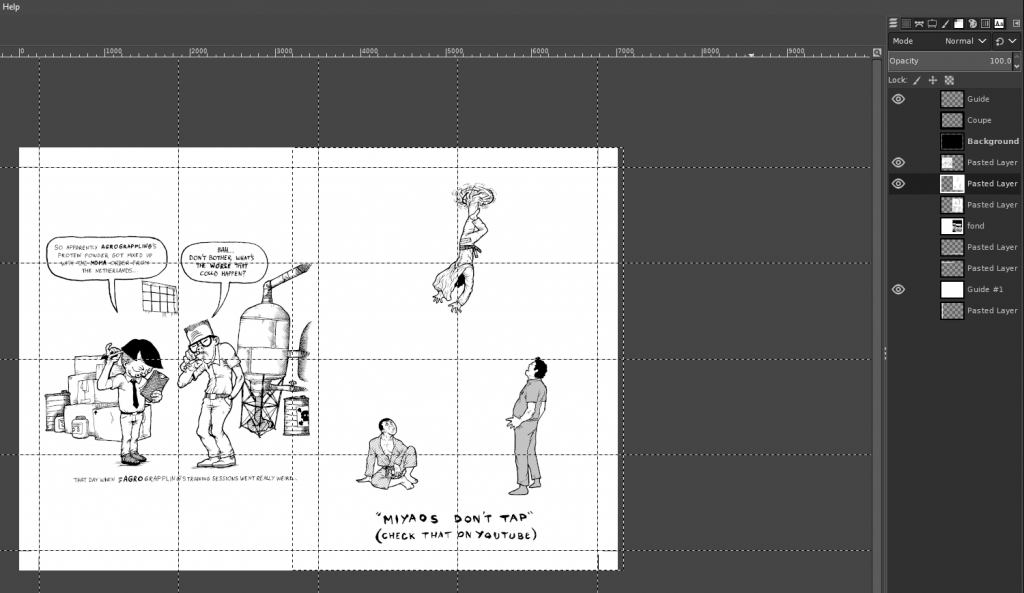
Oh, and that Pettibon illustration? I did a BJJ 10th Planet crossover illustration reference by the way:

Now how’s that for niche!

Crap… I ended up talking BJJ again, we do are an annoying kind… that’s more than enough, no one is reading all that, peace out!

What I learned self-making a 48 pages risograph printed BJJ art book

One of my quarantine project has been to self make a risograph book compiling my best BJJ themed illustrations and mini-comics:

https://igg.me/at/snapbjjporrada

It was a long, complicated path, and I made a lot of wrong turns… Here is what I learned from all this:

Plan, plan, plan! Plan ahead all the boring details, and then… plan some more!

This might sound stupidly evident for people who have already done this kind of stuff, but for me it was my first time doing something like this, and as always, being the stupid stubborn sunavabitch I am, I had to learn it all the hard way…

What happened was that once I decided that I was going to go ahead and do this project, I just wanted (of course) to jump right away on the more exciting stuff: editing and coloring the images.
I thought that I would sort out the technical aspect of the construction of the book while going along… Boy was I wrong… In the end I spent a lot time redoing stuff I had already done… Several times… And it sometimes really took a toll on my motivation.

Here are some concrete examples of my errors:

1) Format, margins, full bleeds…

I knew I wanted to do it in a A5 format, I read the specifications on the printer’s website so I made the cut guides on my GIMP files and thought “OK I got it, I’ll just adjust everything once all is finished!”.

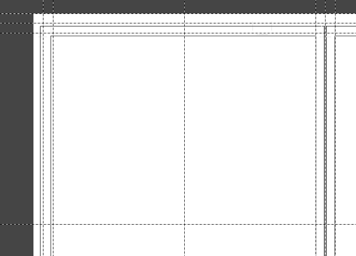
Problem: Well turns out this just doesn’t work… My bleed and Cut margins were a bit off… Not by much, but it still managed to make a mess of all the work I had already done. For the full bleed images, even a small change can really have big consequences if your image had already been adjusted to fit in tightly (the original images were not made with any format in mind, so it was sometimes difficult to make them work in the A5 format).

Solution: I should have communicated earlier with the printer provider, downloaded the specific templates for my project, and work from here.

Also, if you do full bleed illustrations, overextend the illustration on the sides in the drawing stage, because the print & cut margins can sum up to 1cm on each side, so if you didn’t plan it right, you might be obligated to take out some details near the borders, or even redo the whole illustration…

Difference between my guides and the printer’s guides.

Here is another example from my DIY Bootleg A6 Mini-comics Collection:

I self printed the interior pages on one side, and had the color cover painted at a printer… What I didn’t knew (because again… I didn’t ask…) is that the cover files would have a blank 3mm margin, so that the image would be resized automatically, thankfully I made some tests before launching the printing:

In the first test prints, the cut guides ended up showing.
Normally the cut should be right along the letters in the upper left corner.
I reworked the file, but again… Made a mistake and didn’t realized it…

2) Colors

I wanted to color my black in white pieces using 2 colors: a dark blue, and red, and using the values of those for all kinds of effect. So, I just simply used a layer for each color and thought “I’ll convert just them in grey values for the printer afterwards!“.

Working with red values…

Problem: The risograph printing process works like this: Each color will be processed from a black and white image: The darker the area, the more color will be projected there. A full black square will be printed like a red square for example. But if you just take out the color of a 100% red area, it doesn’t convert to 100% black… It will be something like a 60% grey value. The result will be a pink area instead of a red one on the printed page.

Once you got all kinds of gradients interlaced with plain colors on a flattened layer, it’s very difficult to adjust the individual values of specific zones.

The different layers.

Solution: take time to think about the specific printing process your going to use. Talk with the printer, he can direct you to resources and information.

Take one illustration, the more complex one, and do a test run from A to Z in order to obtain a mock-up version of the final file for the printer, and send it to them so that they can confirm you if this would turn out fine

3) The book construction

The construction of the book and pages order… Oh boy…

I had a vague plan and thought “I’ll just assemble that as I’m progressing…“. Also, some illustrations needed 3 colors : Blue, Red and Yellow in order to work, so as a A3 print page is made of 4 images, I had to think which ones would be colored in 3 colors.

One of the 3 colors illustration.

Problem: It means that I couldn’t have 2 different 3 colors images back to back if I only did one A3 page in 3 colors. So that messed up with the order of the pages, and as there are some mini-comics that go on on several pages, this was especially problematic…

This plus the fact that recto-verso is a bitch when you assemble 4 individual images per page (8 per sheet, recto-verso), this plus the 3 colors problem…

One of the 3 colors pages with the layers.

Oh, and my dumb-ass also thought that the pages would be constructed with the A3 pages cut in half in 2 horizontal A4 pages, each containing 2 A5 illustrations. So I thought that each horizontal A4 page would have to be folded in 2 to be assembled (think standard monthly comic page construction).

A4 pages folded in half and stapled in my first DIY test version.

So by the powers of all this combined, I made a looooooot of mistakes, I re-did everything a lot of times, and then I ended up redoing the same mistakes again, and redoing everything… I navigated the perilous waters of stupidity and insanity for a long period… In the end I had to make small mock-ups versions of the book in order to be sure I wasn’t doing any errors…

My mini mock ups versions, so are 4cm tall at max, you can see the colors information on the bottom, to help with the 3 colors pages construction.

Solution: once again… Communicate with the printer. Because of the number of pages (48), the printer informed me that this project couldn’t be constructed by just folding horizontal A4 pages folded in half. Each page would have to be individually cut and glued back… This means I spent a lot of time trying to figure something out… That didn’t needed to be figured out in the first place!

Should I have known this beforehand it would have saved me a lot of time and sanity…

I also highly recommend to make black & white cheap mock-up versions of the final product just to see how the pages will work together!

Make a folder with all the individual pages (if your book doesn’t have page numbers like mine, put the image on one layer, and one another layer the page number) and work from here as early as possible a small mock-up version.

Then, once you’ll receive the printer templates, you’ll be able to reconstruct the book from here. And then only work on the final versions!

This will save you a looooot of time, I guarantee it.

So, in conclusion:

-PLAN AHEAD all the boring technical details before jumping of the “fun” part!

TALK TO THE PRINTER as early as possible! Retrieve his technical specifications, his templates, ask him questions along the way! He can direct you to a lot of resources and information!

MAKE DIY MOCK-UP VERSIONS OF THE FINISHED PRODUCT! It will not only help with the book construction, but also for the motivation!
Working on something like this takes a lot of time, and you can sometimes lose the motivation. Having a mock-up version available you can go back to really does wonders! Flip through it, feel it, imagine the final book, it really helps staying focused.

Some more random advice:

-If you plan on doing full bleed illustrations, really extend the illustration way beyond the intended margin! You’ll thank me later.

-When sketching and drawing the individual comic panels, make a sketch mock-up including the word balloons with the text in it! Sometimes I draw a cool picture, and later struggle to insert the text because I didn’t planned where I would fit it exactly before.

-Check out Ed Piskor‘s and Jim Rugg‘s CARTOONIST KAYFABE Youtube Channel, it is a golden mine of technical advices, every illustrator/cartoonist should watch those religiously!

Cartoonist Kayfabe Youtube Channel

Well that’s it! Hope it helps someone to make less mistakes than I did!