How to create your own font with GIMP and GLYPHR STUDIO ONLINE

One my weak points has always been the lettering, I mean sometimes in my everyday life I can’t even read back what I wrote…

As I’m currently making comics and that I don’t want to use a preexisting font, I decided to create my own, based on my handwriting.

Sure there are already some websites that propose something like that, but I found those not to be very practical : the number of characters is limited, or you got to pay to download your font, or you got to print a page, than scan it…

Anyway, thanks to a friend I found a very easy way to create a font using GIMP and the free version of GLYPHR STUDIO ONLINE:

1 – Preparing the letters and symbols in Gimp:

First I drew all the letters and symbols I needed and scanned them in Gimp using a grayscale 600 dpi resolution:

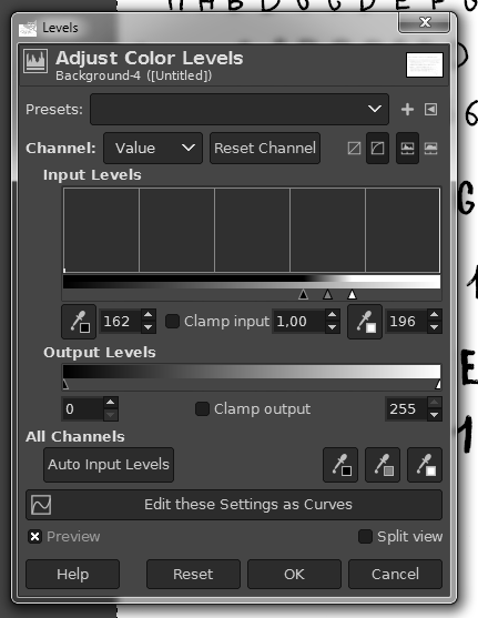
I then played with the Levels in the Colors Menu in order to clean a bit the image:

Using the Crop To Selection function in the Image Menu, I then selected the first letter:

This is were you can work a bit on the letter with the Pencil Tool in order to fill the little white parts, you can work on the contour or rotate it if needed (you can also work on the letters later in the Glyphr Studio, but I felt more comfortable doing it here at this stage):

By the way, you don’t have to worry about the size of the canvas or anything.

Using the Select By Color in the Select Menu, I then click on a black part of the letter so that the shape of the letter becomes the selection:

Then in the Path Section:

I click on Selection to path:

Here is the result:

Then I right click on the “A” and choose Export Path:

Here GIMP will export the shape as .svg file, but doing so the file created lacks the “.svg” sufix… It’s weird and I don’t know why… So you end up with something like this:

In order to solve this you just have to rename the file manually and add the .svg suffix:

And then you redo all of this for each of the letters and symbols and you end up with something like this:

2 – Creating the font with Glyphr Studio Online:

Now, we head up to the Glyphr Studio Online:

Here we click on New, write the name of the font, and click on Start a new font from scratch:

We arrive here:

We click ont the “9” in the top left corner, which is the Navigate Menu:

We then choose Import SVG:

Here on the left part of the screen you click on the letter you want to import, and then you drag and drop your corresponding .svg file on the part in the right and click on the blue button Import SVG just below:

You can then adjust the size of the letter, modify it if needed (I’ll let you play with that). You then repeat this for all the other letters and symbols, one by one, and you end up with this:

Once you have uploaded all your letters and symbols, you can save the file so that you can re-upload it later and work on it if needed, the file will be a .txt format:

At any point you can head-up to the Navigate Menu and click on the Test Drive Section:

Here you can test your font:

All is left is to export and download your font in the .otf format in the Navigate Menu:

In order to install the font you just created, you copy the .otf file you just downloaded in the WINDOWS/FONTS directory:

This is just scratching the surface, there are a lot more options, but this will allow you to create your first font pretty easily.

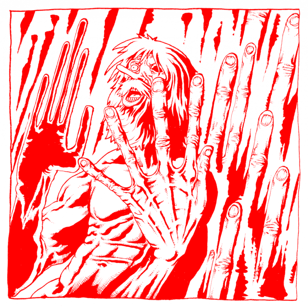
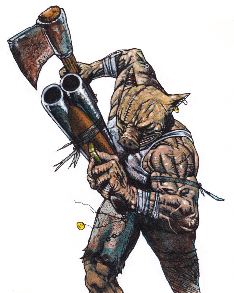
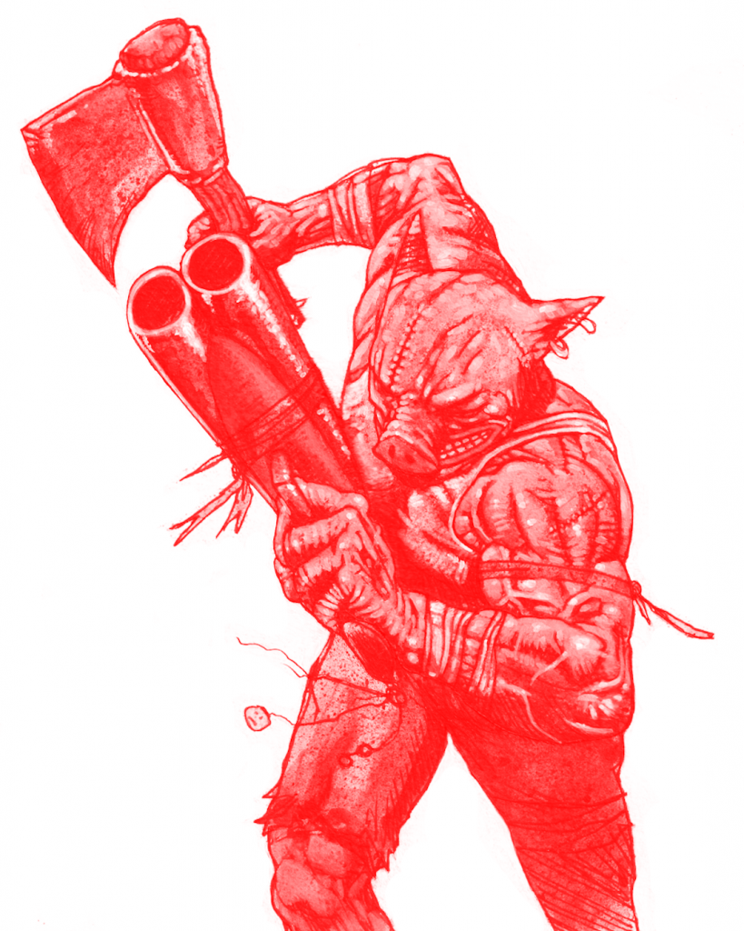
This font is being used in my 2 current (may of 2020) projects:

First, the risograph collection of my best BJJ themed illustrations and comics:

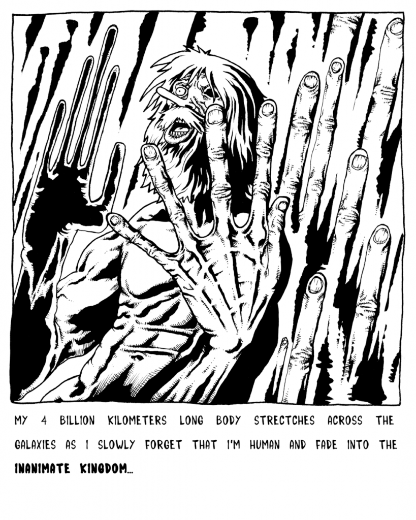
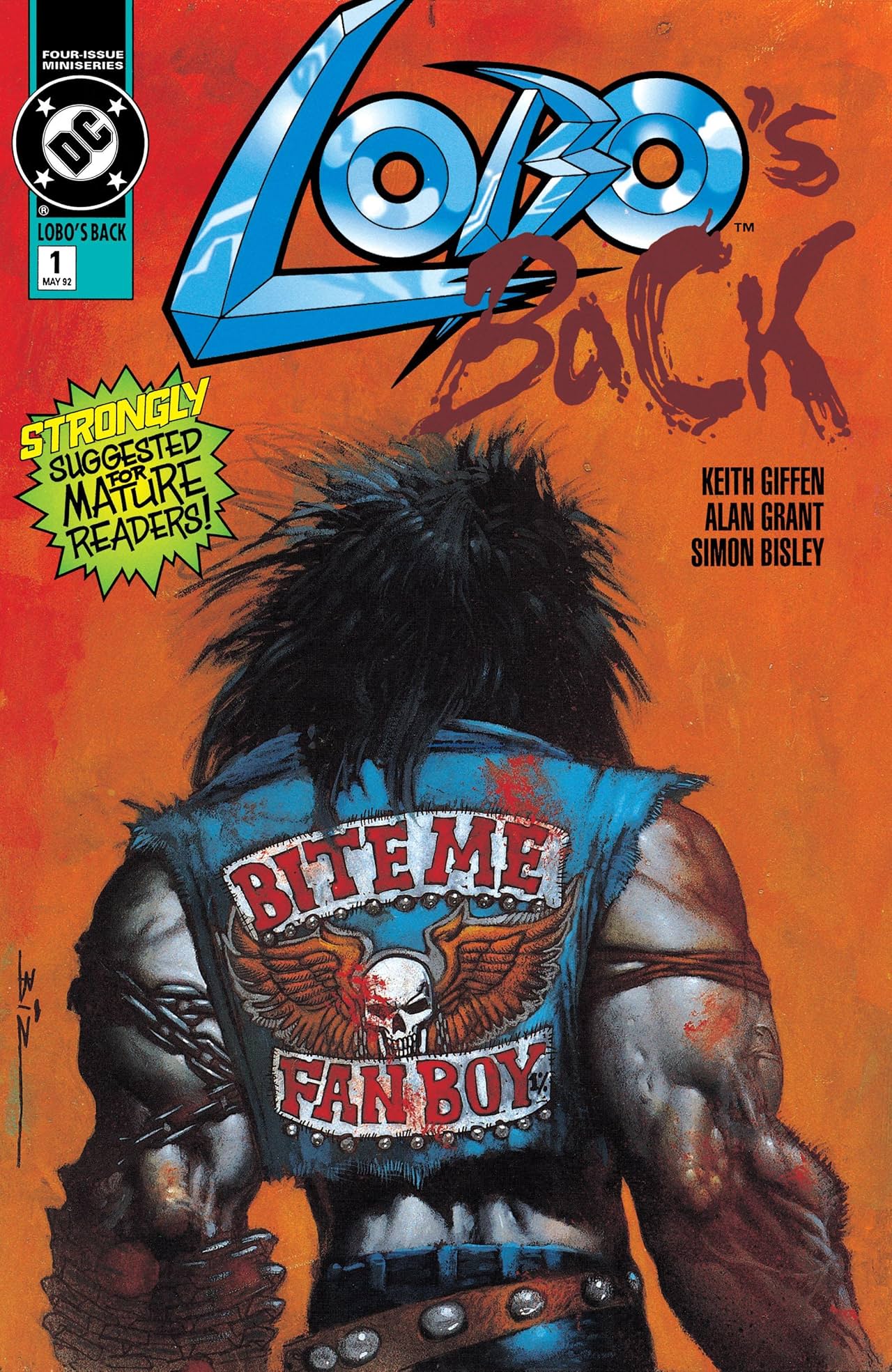
And also, my current ongoing quarantime comic, The Crucial Corona Chronicles:

You can read it here (click on the image):

CMY color decomposition for printing with GIMP

I am currently (may of 2020) in the process of self publishing the collection of my best BJJ themed illustrations and comics:

This project is going to be printed in risograph colors, so I needed to convert some of my illustrations in 3 different layers for the 3 colors: Yellow, Magenta and Cyan for the printer.

Note : I didn’t use a Black layer (the K in CMYK) for this.

Searching online I found that the CMY decompose function in Gimp doesn’t seem to work correctly, so I had to come up with a really simple trick in order to achieve the results I wanted.

Here’s the acrylic painting that is being used for this project, it’s a take on the iconic LOBO’s Back! comic cover (click here to see the original) with a BJJ twist:

So, in order to prepare the image for risograph printing, I’m going to use the Decompose function in the Colors Menu >> Components >> Decompose:

Next, I am going to choose RGB and Decompose to layers :

The result is a new image with 3 layers:

Here are the 3 layers put side to side just so you can see the result (in reality they are on top of each other):

GIMP has given those layers the RGB colors automatically:

The one on the left has been called RED
The one in the middle is called GREEN
The one to the right is called BLUE

Now, to understand how the color printing works, the darker the area, the more color will be applied, and then by superposition the initial colors will appear in the printing, but… As you can see, if we use those layers like that it doesn’t work: the painting’s background is orange, so there should be a lot or yellow and some red, but here it’s the blue layer that is the darker one…

The trick is to simply rename the layers like this:

The BLUE layer will be used for the YELLOW ink
The GREEN layer will be used for the MAGENTA ink
The RED layer will be used for the CYAN ink

I just sent those layers to the risograph printer for the test prints of my projects, and here is the result:

The colors aren’t exactly the same because : 1 – it’s risograph, and 2 – I just used standard Yellow, Red and Blue inks instead of searching for Magenta and Cyan ones, I suppose if I did so the result would be better. But here you go, easy CMY color decomposition using the RGB function and simply renaming the layers.

How to make an anaglyph image (the old school red and blue 3D effect) with depth using GIMP

In my current quarantine comic project called The Crucial Corona Chronicles, at one point the main character is starving and eats an old oyster ceviche can whose expiration date was in 1982 as a last resort and starts hallucinating as a result.
This allowed me to have some fun doing some more experimental panels than the usual black and white ones I decided to use for this project. For one of those oyster induced hallucinations panels I decided to use this cool retro red and blue 3D effect:

I searched for online tutorials but none of them worked for me, they were either too Photoshop orientated and I didn’t found the equivalence in GIMP, or they didn’t explain exactly what you needed to do, or didn’t use a depth effect. The more useful was this one, but I needed to adapt it to GIMP:

1 – THE DISPLACEMENT MAP

So let’s go, here is the original image:

First, we are going to create a Displacement map, which will allow to create the depth in the final image:

This image is in black and white, where the more dark areas are going to appear nearer than the clear ones in the final image. I created a new layer on top of the one with the line art (called “Ink” here), called it Displace, and reduced it’s opacity to 90%, and traced the shapes by transparency using the Free Select Tool:

In the tutorial link I posted earlier, they say that the white parts are going to appear nearer than the dark ones, but for me it didn’t work, I don’t know if it’s because I’m using GIMP or because of another reason, but it’s only when I inverted the black and white values that the effect worked the way I intended to.

Here for example the hand in black will appear nearer than everything else.

In order to have the effect blend in more naturally, I brought back the opacity of the Displace layer to 100%, and applied the Gaussian Blur (Filter menu >> Blur >> Gaussian Blur) filter using a 10 value:

Here’s the result:

2a – THE RED AND CYAN IMAGES:

Now, onto creating the red and blue versions of the line art. As my line art is purely black and white (if your image is in grey tones or even color, see below section 2b), I simply choose Select By Color (Select Menu >> Select By Color) and clicked on a black area of my line art (“Ink“) layer:

I then created a new layer filled with white, which I called Red, and filled the selected areas with pure red:

Here’s the result:

I did the same thing on a new layer called Cyan, but this time I selected the Blue and Green channels and put their value to 100 while putting the Red in 0:

I now have to layers, one Red and one Blue on top of each other:

2b – If you’re using an image with grey tones or even color, basically you want one layer where all the output values are Red, taking out all the Blue and Green, and another one where all the output values are Cyan (Green and Blue), taking out only the Red.

Here’s one way I found to do this, I am going to use my OINK fan art painting for this:

First, let’s convert this image to black and white values using the Saturation tool in the Colors Menu >> Saturation and bringing the Scale down to 0:

Let’s then duplicate this layer using the Duplicate layer option right clicking on the layer:

I then create a new layer and I fill it with Red and place it on top of the first black and white Oink layer, and another layer that I fill with Cyan (Blue and Green to 100 and Red to 0) and place it on top of the other black and white Oink layer:

Then, we convert each one of the colored layers to Screen mode instead of Normal:

The result will look like this:

You then to the same thing with the Cyan layer, etc. You can now use the rest of the tutorial (you will need to to a Displacement Map before of course, see part 1):

3 – CREATING THE 3D DEPTH EFFECT:

We are going now to use the Displacement map created earlier, so I select first the Red layer and will use the Displace filter (Filters menu >> Map >> Displace), a window will show up:

First I’m going to click in the ? part just between Aux Input and (none) and select the Displacement Layer created earlier:

And then I’m going to click on the chain link in order to be able to manipulate the Horizontal Displacement value independently from the Vertical one. For this image I choose -15, but you can play with this value and find what works best for your image:

After clicking OK, we will now redo the exact same steps for the Cyan layer, but this time I’m choosing +15 for the value:

Now the layers should be like this:

4 – ET VOILA!

Finally, I select the Red layer which is on top of the Cyan one and change its Mode to Multiply instead of Normal:

And that’s it! the final image looks life this:

Well that’s it… Oh… I also did my own DIY 3 glasses:

The red is for the left eye, and the blue… Well I think you’ll be able to manage this on your own!

You can read The Crucial Corona Chronicles here:

Also, as of may of 2020 I’m also currently doing an Indiegogo campaign in order to try to self publish my first comic/illustration book, please consider checking this out (click on the image):