BJJ saved my… Art (???)

Allow me to present you a slightly different take on the overused and classic «BJJ saved my life, bro* !» Motto. (the “bro” is optional, bro).

My first consuming hobby has been drawing, and so, naturally, in my early twenties I tried to get something going on with my art. I did some commissioned work, some fantasy & sci-fi illustrations in the RPG field, and also some bands artworks, but I never managed to get the ball really rolling. This led me to little by little lose faith and motivation, and in consequence to slow down to an almost complete halt my drawing.

Furthermore, the pressure I felt trying« to make it» professionally was taking out all the fun away from the act of drawing. Feeling like each illustration needed to be my defining masterpiece brought too much stress into the process, and always ending up disappointed with the results took its toll. I also realized that I wasn’t able to conjure any real creativity in my art. My main visual influences came from the comics, the medieval fantasy and the sci-fi universes often explored in the role playing and tabletop games, and of course also the metal albums covers, so I tried to inject all of this material into my art, but everything I produced always felt so lame and cringe… It was just the talentless and uninspired regurgitation of the same old warriors and robots, the same old skulls, the same old masked vigilantes…

Does the world really need another Bisley wannabe?

Fast-forward 29 and I had almost abandoned drawing and painting, just barely scribbling on some rare occasions. It was at this time that I encountered Brazilian Jiu-jitsu, and as most practitioners, became immediately hooked, I went to training 5 times the first week. It turned into a complete obsession for a few years. Every second of my free time, every conscious thought, was dedicated to this burning new passion. The addiction finally dialed down a bit during my brown belt days, after about 8 years of intense practice. I now consider my relation to BJJ to be a healthy one : I train 2–3 times a week, teach some classes, and still love to compete a few times a year.

GOATest flyer of all time.

It’s when I became in charge of organizing the monthly open mats at my BJJ club in Paris a few years back that those crazy NYHC flyers I saw in fanzines in my late teens crept up to my mind ! Something clicked right away : wouldn’t it be fun to do some cool flyers for those open mats by mixing those passions of mine ? Maybe I could transpose this punk-HxC-metal energy I loved so much into the BJJ realm ! It seemed fresh and new, and at the time I had never seen such a combination.

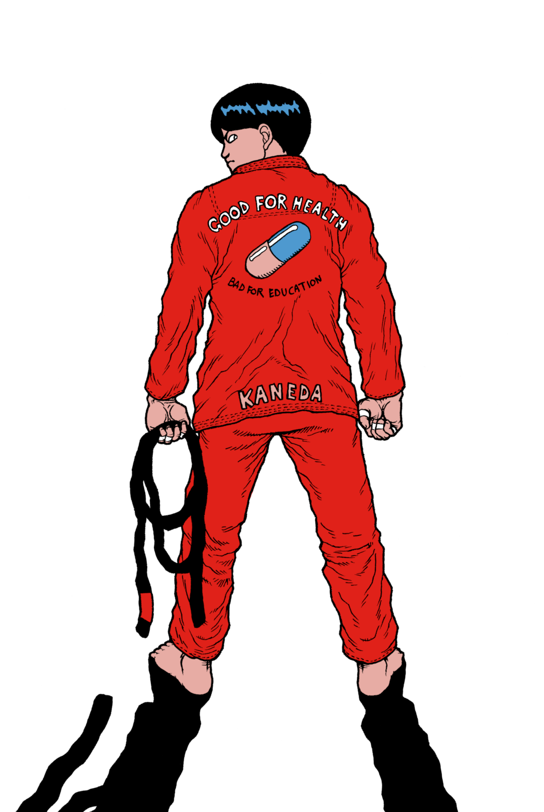
High with excitement, I started drawing again with a first obsessive image : Kaneda from Akira in its classic iconic pose, but wearing in a BJJ GI !

KANEDAAA !!!

Next came the Flying Khabibs :

Never mind the old IG handle

And after that, the They Live BJJ mashup:

This ended up as a sold out serigraph, and as my BJJ club’s shirt

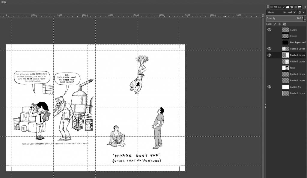
I since did a lot of other BJJ related artworks and mini-comics, and the ideas started to flow non-stop, so much that I couldn’t even keep up, and in the end I wasn’t able to draw all of them. When COVID hit, I found myself with a lot of free time, and decided to produce a risograph collection of the BJJ comics and illustrations I had done, I also produced a free .pdf zine about stretching amongst other things.

SNAP !

It came to me after a while that I was able to tap into this new creative flow almost at will, and not only for my BJJ related illustrations, but for any other project. I am now almost burdened with so many ideas for comics and illustrations that I will never be able to draw them all in my remaining lifetime.

Another crucial thing I learned from practicing BJJ that I was able to incorporate into my drawing came from competing. I competed a lot since white belt, and after a few years of frustrating losses and fulfilling wins, I realized that the mindset one has to embrace to be able to overcome losing also translates very well for any creative endeavor.

The fear of messing up an illustration even before starting it petrified me. I would often redraw them countless times at the first sight of a mistake because I felt that I needed to produce my Mona Lisa tight here and now, with each new illustration. So, I started again and again from scratch at the first little minor inconvenience, hoping to produce a better version with each new iteration. Instead, came loss of interest and excitement for the subject, which of course led to worst results further down the line… Down until a final illustration was painfully excreted, devoid of any spontaneity, leaving me frustrated and discouraged.

When you compete in BJJ, especially if you’re not a professional, you’re soon slapped in the face with the realization that you are bound to lose at some point. It’s just part of the game. Me, I quickly realized and internalized that I wasn’t going to be the next BJ Penn, let alone a world champion. Even when training 5 times a week, I was still just a hobbyist comparing to others, and I’m at peace with that. Still, this hasn’t prevented me from having some great performances, some of which I am very proud of… Sometimes scoring some surprising upsets, and some even being losses where I gave it all, took no shortcuts, and searched for no excuses afterwards for once.

When shit happens in a BJJ match, the important thing is to not give up. Due to the nature of the rules of this martial art, even if you’re being steamrolled 30-0, the hope of catching the opponent with a submission to end up the winner always remain. It’s crucial to stay calm, assess the present situation, and find ways to improve it. At one point I came to the realization that the same goes for drawing : an ink stain, an error in anatomy or perspective… You can’t just take the easy way out and discard the illustration. You have to work with the reality of the situation and have got to find a way to make it work !

Instead of trying to be the best amongst others, I understand now I have to focus on being the best I can be. Even if this match I just lost isn’t my greatest performance, I can still use it as a learning tool for the next one. Same goes for my art production : this particular illustration I’m working on may not be perfect, but I now realize it’s just a step for the next one. My Mona Lisa is still waiting patiently for me somewhere down the line. By applying this mentality I learned thanks to BJJ competition to my art, I am now able to look past the imperfections of the situation and focus on finishing it. Done is better than perfect, always, and there will be another one after that, and another one after…

Thinking back, it really feels to me that BJJ unlocked something in my mind regarding creativity. The tap is now open, and I am able to drink from this source at will for my art. I wouldn’t be where I am right now with my creativity without BJJ, so…

BJJ did save my art… Bro !

For those interested in reading more about the creativity process, you’ll find more blog posts about it : here and here.

“Oss” as we say in this business of ours of breaking joints and choking people!

What I learned self-making a 48 pages risograph printed BJJ art book

One of my quarantine project has been to self make a risograph book compiling my best BJJ themed illustrations and mini-comics:

https://igg.me/at/snapbjjporrada

It was a long, complicated path, and I made a lot of wrong turns… Here is what I learned from all this:

Plan, plan, plan! Plan ahead all the boring details, and then… plan some more!

This might sound stupidly evident for people who have already done this kind of stuff, but for me it was my first time doing something like this, and as always, being the stupid stubborn sunavabitch I am, I had to learn it all the hard way…

What happened was that once I decided that I was going to go ahead and do this project, I just wanted (of course) to jump right away on the more exciting stuff: editing and coloring the images.
I thought that I would sort out the technical aspect of the construction of the book while going along… Boy was I wrong… In the end I spent a lot time redoing stuff I had already done… Several times… And it sometimes really took a toll on my motivation.

Here are some concrete examples of my errors:

1) Format, margins, full bleeds…

I knew I wanted to do it in a A5 format, I read the specifications on the printer’s website so I made the cut guides on my GIMP files and thought “OK I got it, I’ll just adjust everything once all is finished!”.

Problem: Well turns out this just doesn’t work… My bleed and Cut margins were a bit off… Not by much, but it still managed to make a mess of all the work I had already done. For the full bleed images, even a small change can really have big consequences if your image had already been adjusted to fit in tightly (the original images were not made with any format in mind, so it was sometimes difficult to make them work in the A5 format).

Solution: I should have communicated earlier with the printer provider, downloaded the specific templates for my project, and work from here.

Also, if you do full bleed illustrations, overextend the illustration on the sides in the drawing stage, because the print & cut margins can sum up to 1cm on each side, so if you didn’t plan it right, you might be obligated to take out some details near the borders, or even redo the whole illustration…

Difference between my guides and the printer’s guides.

Here is another example from my DIY Bootleg A6 Mini-comics Collection:

I self printed the interior pages on one side, and had the color cover painted at a printer… What I didn’t knew (because again… I didn’t ask…) is that the cover files would have a blank 3mm margin, so that the image would be resized automatically, thankfully I made some tests before launching the printing:

In the first test prints, the cut guides ended up showing.
Normally the cut should be right along the letters in the upper left corner.
I reworked the file, but again… Made a mistake and didn’t realized it…

2) Colors

I wanted to color my black in white pieces using 2 colors: a dark blue, and red, and using the values of those for all kinds of effect. So, I just simply used a layer for each color and thought “I’ll convert just them in grey values for the printer afterwards!“.

Working with red values…

Problem: The risograph printing process works like this: Each color will be processed from a black and white image: The darker the area, the more color will be projected there. A full black square will be printed like a red square for example. But if you just take out the color of a 100% red area, it doesn’t convert to 100% black… It will be something like a 60% grey value. The result will be a pink area instead of a red one on the printed page.

Once you got all kinds of gradients interlaced with plain colors on a flattened layer, it’s very difficult to adjust the individual values of specific zones.

The different layers.

Solution: take time to think about the specific printing process your going to use. Talk with the printer, he can direct you to resources and information.

Take one illustration, the more complex one, and do a test run from A to Z in order to obtain a mock-up version of the final file for the printer, and send it to them so that they can confirm you if this would turn out fine

3) The book construction

The construction of the book and pages order… Oh boy…

I had a vague plan and thought “I’ll just assemble that as I’m progressing…“. Also, some illustrations needed 3 colors : Blue, Red and Yellow in order to work, so as a A3 print page is made of 4 images, I had to think which ones would be colored in 3 colors.

One of the 3 colors illustration.

Problem: It means that I couldn’t have 2 different 3 colors images back to back if I only did one A3 page in 3 colors. So that messed up with the order of the pages, and as there are some mini-comics that go on on several pages, this was especially problematic…

This plus the fact that recto-verso is a bitch when you assemble 4 individual images per page (8 per sheet, recto-verso), this plus the 3 colors problem…

One of the 3 colors pages with the layers.

Oh, and my dumb-ass also thought that the pages would be constructed with the A3 pages cut in half in 2 horizontal A4 pages, each containing 2 A5 illustrations. So I thought that each horizontal A4 page would have to be folded in 2 to be assembled (think standard monthly comic page construction).

A4 pages folded in half and stapled in my first DIY test version.

So by the powers of all this combined, I made a looooooot of mistakes, I re-did everything a lot of times, and then I ended up redoing the same mistakes again, and redoing everything… I navigated the perilous waters of stupidity and insanity for a long period… In the end I had to make small mock-ups versions of the book in order to be sure I wasn’t doing any errors…

My mini mock ups versions, so are 4cm tall at max, you can see the colors information on the bottom, to help with the 3 colors pages construction.

Solution: once again… Communicate with the printer. Because of the number of pages (48), the printer informed me that this project couldn’t be constructed by just folding horizontal A4 pages folded in half. Each page would have to be individually cut and glued back… This means I spent a lot of time trying to figure something out… That didn’t needed to be figured out in the first place!

Should I have known this beforehand it would have saved me a lot of time and sanity…

I also highly recommend to make black & white cheap mock-up versions of the final product just to see how the pages will work together!

Make a folder with all the individual pages (if your book doesn’t have page numbers like mine, put the image on one layer, and one another layer the page number) and work from here as early as possible a small mock-up version.

Then, once you’ll receive the printer templates, you’ll be able to reconstruct the book from here. And then only work on the final versions!

This will save you a looooot of time, I guarantee it.

So, in conclusion:

-PLAN AHEAD all the boring technical details before jumping of the “fun” part!

TALK TO THE PRINTER as early as possible! Retrieve his technical specifications, his templates, ask him questions along the way! He can direct you to a lot of resources and information!

MAKE DIY MOCK-UP VERSIONS OF THE FINISHED PRODUCT! It will not only help with the book construction, but also for the motivation!
Working on something like this takes a lot of time, and you can sometimes lose the motivation. Having a mock-up version available you can go back to really does wonders! Flip through it, feel it, imagine the final book, it really helps staying focused.

Some more random advice:

-If you plan on doing full bleed illustrations, really extend the illustration way beyond the intended margin! You’ll thank me later.

-When sketching and drawing the individual comic panels, make a sketch mock-up including the word balloons with the text in it! Sometimes I draw a cool picture, and later struggle to insert the text because I didn’t planned where I would fit it exactly before.

-Check out Ed Piskor‘s and Jim Rugg‘s CARTOONIST KAYFABE Youtube Channel, it is a golden mine of technical advices, every illustrator/cartoonist should watch those religiously!

Cartoonist Kayfabe Youtube Channel

Well that’s it! Hope it helps someone to make less mistakes than I did!