Blitzpainting : how and why?

As many illustrators using “traditional” media, I feel that my finished artwork loses a lot of the initial movement and energy that was contained in the initial sketches…

“The eternal battle between controlled tightness and raw energy”

Postulate: Whatever is gained in tightness is forever lost in raw energy. Which we can translate to:

T=1/E

(T : Tightness – E : Energy)

As you go through several tightening steps between the initial sketch to the final piece, using a light table for example, I feel that whatever is gained in “tightening” is lost in counterpart in movement and energy. The cause might be that when producing the final art, one is very concentrated in not making any mistakes, and thus one does not allow the hand to move freely across the canvas. Each line feels more controlled and loses its wild energy.
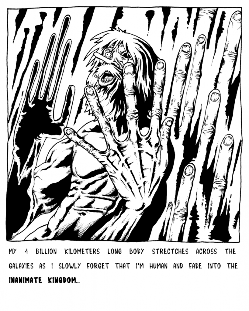
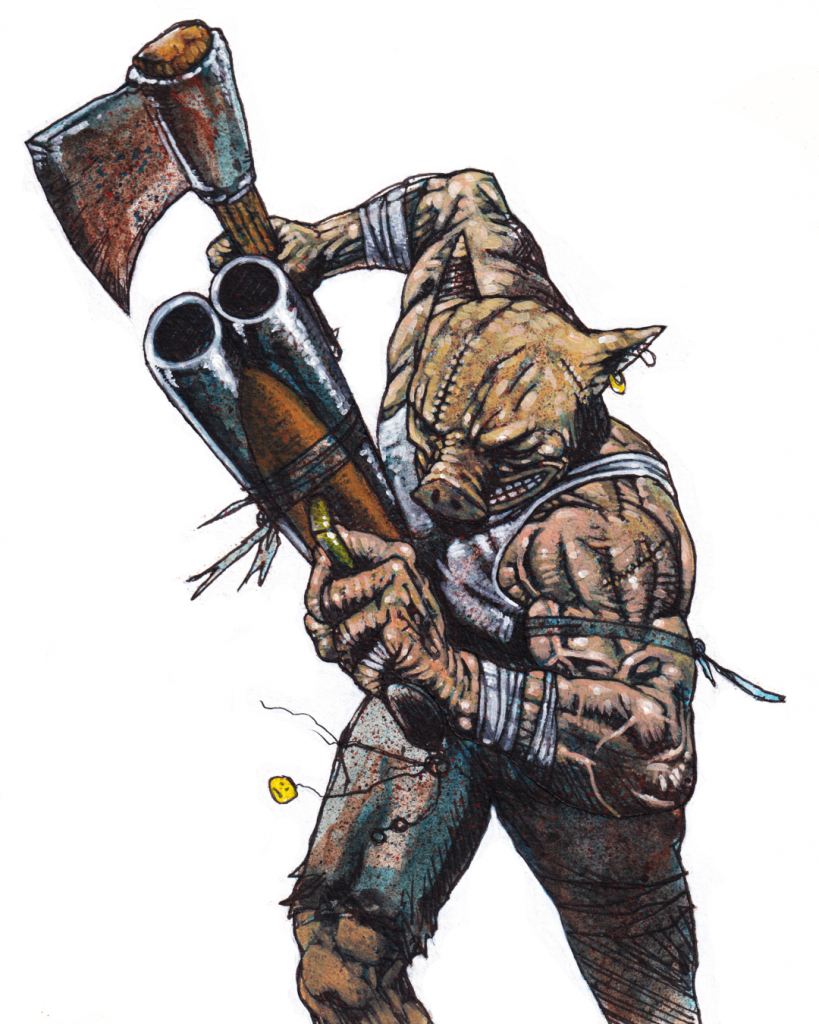
Some examples:

Each steps brings more “tightness” and control, but loses some energy doing so…
From initial sketch to a more advanced step, you can already notice a decrease in the intensity of the emotions.
Once again, the rough sketch conveys more expressiveness than the finished inked art.
I thing you get it so I’ll stop now.

I found several tips in how to try to fight this phenomenon, but now I want to talk about a particular exercise that I found very helpful for keeping that free initial energy: Blitzpainting.

The concept is simple, you start drawing, no preparation, no previous sketches, no constructions lines, and you produce a finished piece of artwork with this piece, in the course of a few hours (2 or 3).

The most important thing it teaches you it to work around you mistakes, in other words FIND A WAY TO MAKE IT WORK! If you make a mistake, do not start over: draw on top, blacken the zone, paint on top, throw a splatter… Those unexpected moments, “accidents” you might call them,might end up creating some interesting results!

I started to think about during my Brazilian Jiu-Jitsu practice: when you are rolling or competing, if you end up in a bad spot, you cannot just stop and start over! You have to keep on and try to find a way to improve the situation, and try at least to finish in a better spot. This mentality transferred to drawing/painting as been very liberating and has helped me a lot!

Now, onto the concrete stuff! As I am self taught, mainly through analyzing (meaning “drooling over”) the painting styles of Simon Bisley, Glenn Fabry, Bill Sienkiewicz, John Mueller, Dave McKean… the techniques I am using might not be the academic ones, but they are the one I understand, love, and use.

Those paintings are 20 by 15 cm, using acrylic paint.

A quick note here : there is a real difference between the cheap low quality paint and the high quality ones. The later have much more pigment, and thus a much more covering power. This is particularly important as the use of thick layers will be used for effect. If the paint isn’t opaque enough you will have to make many layers, and as you cannot replicate exactly each stroke, it may give a blurry effect on some parts. You can always dilute the paint with some water, but it’s much more hard to thicken it (you have to use some special products, which change the intensity of the color depending on the mix…). This is especially through for light colors like yellow.

Here are some process shots of a blitzpainting I did of Mark Hunt elbowing Bigfoot Silva in the face (sorry Bigfoot, but this picture is too dope!):

1- The reference picture

I believe the correct sound effect in a comic would be “SPRLOUNTCHK!

2- The canvas

Pro-tip for the masking tape, before applying it on the paper, glue it a few times to your jeans first in order to diminish its gluing power, or it might rip up the paper when taking it out.

I also realized it’s been a while I haven’t sketched with a pencil, I don’t know why exactly, but it also helps to “jump” directly into the final processing stage.

3- The line art

As I free handed the line art, you can already see some differences in Bigfoot’s lower body, also the framing isn’t the same as the picture… Instead of redoing it, I’ll just go along with this.

4- Establishing some values

I quickly lay some diluted paint. I use a mix of black and blue paint in order to establish some shadows, it’s done very loosely.

5- The under layer

Now I mix some brown/red/magenta/purple depending on the mood and I drop a layer on the whole painting, this will allow to have a common base which will serve to unify the whole thing. I also throw some splatters with an old toothbrush, this creates some texture while being very fun!

6 – Some thicker layers

This is the really fun part where you can start to see how the finished piece will look. The thicker parts are used to “block”texture underneath. The imperfections of the strokes create interesting textures already. You can also re-add some color splatters at every stage to give it a more wild and dynamic look.

7- Almost there…

Adding details, giving more attention to the important parts : heads, hands… Using some blue mixed with the skin tone for the transition shadows can give some cool effects.

8- “Et Voilà”!

I finished the background, used some non-diluted red for the blood, a bit more details here and there… At this stage it’s been between 2 to 3 hours non stop, I’m starting to worry that each new stroke might damage more the piece than improving it, so it’s a good time to stop.

9- The final canvas without the masking tape

At this stage it’s very important to take out the masking tape very carefully!

10- The final artwork with some digital adjustments for the colors

Final thoughts:

It’s far from perfect, but that was part of the deal, I feel that for a “finished” piece done in under 3 hours the results are good. I could always come back to it if I wanted to polish it more anyway.

I should have laid a thicker black background in order to have the cool red blood splurting out of Bigfoot’s face stand out more.

I now have to find a way to translate this to my pure black and white artwork which I feel is very “controlled” and lacks energy.

One thing that I did for this particular piece was announcing it live on my Instagram stories beforehand, and then I posted a picture live of each step live. This had the effect of forcing me to finish it, and to not pussy out of this. I will surely redo this because I felt the added “pressure” forced me to try to give my best. I’m thinking maybe doing some live paintings soon. If you want to follow live the next ones you can head to my Instagram and give me follow.

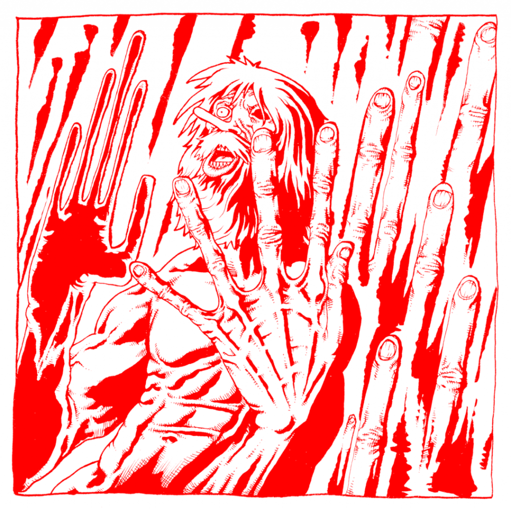
Some other blitzpaintings:

Garry Tonon the Lionkiller at One FC

Phil Edwards painting
process shot of the splattering stage!

Well that’s it! Hope you liked it! I really encourage you to try this, especially the “live” part on Instagram (or Facebook, Youtube…). Don’t hesitate to let me know how it worked for you, and share your tips!

OSS!

What I learned self-making a 48 pages risograph printed BJJ art book

One of my quarantine project has been to self make a risograph book compiling my best BJJ themed illustrations and mini-comics:

https://igg.me/at/snapbjjporrada

It was a long, complicated path, and I made a lot of wrong turns… Here is what I learned from all this:

Plan, plan, plan! Plan ahead all the boring details, and then… plan some more!

This might sound stupidly evident for people who have already done this kind of stuff, but for me it was my first time doing something like this, and as always, being the stupid stubborn sunavabitch I am, I had to learn it all the hard way…

What happened was that once I decided that I was going to go ahead and do this project, I just wanted (of course) to jump right away on the more exciting stuff: editing and coloring the images.
I thought that I would sort out the technical aspect of the construction of the book while going along… Boy was I wrong… In the end I spent a lot time redoing stuff I had already done… Several times… And it sometimes really took a toll on my motivation.

Here are some concrete examples of my errors:

1) Format, margins, full bleeds…

I knew I wanted to do it in a A5 format, I read the specifications on the printer’s website so I made the cut guides on my GIMP files and thought “OK I got it, I’ll just adjust everything once all is finished!”.

Problem: Well turns out this just doesn’t work… My bleed and Cut margins were a bit off… Not by much, but it still managed to make a mess of all the work I had already done. For the full bleed images, even a small change can really have big consequences if your image had already been adjusted to fit in tightly (the original images were not made with any format in mind, so it was sometimes difficult to make them work in the A5 format).

Solution: I should have communicated earlier with the printer provider, downloaded the specific templates for my project, and work from here.

Also, if you do full bleed illustrations, overextend the illustration on the sides in the drawing stage, because the print & cut margins can sum up to 1cm on each side, so if you didn’t plan it right, you might be obligated to take out some details near the borders, or even redo the whole illustration…

Difference between my guides and the printer’s guides.

Here is another example from my DIY Bootleg A6 Mini-comics Collection:

I self printed the interior pages on one side, and had the color cover painted at a printer… What I didn’t knew (because again… I didn’t ask…) is that the cover files would have a blank 3mm margin, so that the image would be resized automatically, thankfully I made some tests before launching the printing:

In the first test prints, the cut guides ended up showing.
Normally the cut should be right along the letters in the upper left corner.
I reworked the file, but again… Made a mistake and didn’t realized it…

2) Colors

I wanted to color my black in white pieces using 2 colors: a dark blue, and red, and using the values of those for all kinds of effect. So, I just simply used a layer for each color and thought “I’ll convert just them in grey values for the printer afterwards!“.

Working with red values…

Problem: The risograph printing process works like this: Each color will be processed from a black and white image: The darker the area, the more color will be projected there. A full black square will be printed like a red square for example. But if you just take out the color of a 100% red area, it doesn’t convert to 100% black… It will be something like a 60% grey value. The result will be a pink area instead of a red one on the printed page.

Once you got all kinds of gradients interlaced with plain colors on a flattened layer, it’s very difficult to adjust the individual values of specific zones.

The different layers.

Solution: take time to think about the specific printing process your going to use. Talk with the printer, he can direct you to resources and information.

Take one illustration, the more complex one, and do a test run from A to Z in order to obtain a mock-up version of the final file for the printer, and send it to them so that they can confirm you if this would turn out fine

3) The book construction

The construction of the book and pages order… Oh boy…

I had a vague plan and thought “I’ll just assemble that as I’m progressing…“. Also, some illustrations needed 3 colors : Blue, Red and Yellow in order to work, so as a A3 print page is made of 4 images, I had to think which ones would be colored in 3 colors.

One of the 3 colors illustration.

Problem: It means that I couldn’t have 2 different 3 colors images back to back if I only did one A3 page in 3 colors. So that messed up with the order of the pages, and as there are some mini-comics that go on on several pages, this was especially problematic…

This plus the fact that recto-verso is a bitch when you assemble 4 individual images per page (8 per sheet, recto-verso), this plus the 3 colors problem…

One of the 3 colors pages with the layers.

Oh, and my dumb-ass also thought that the pages would be constructed with the A3 pages cut in half in 2 horizontal A4 pages, each containing 2 A5 illustrations. So I thought that each horizontal A4 page would have to be folded in 2 to be assembled (think standard monthly comic page construction).

A4 pages folded in half and stapled in my first DIY test version.

So by the powers of all this combined, I made a looooooot of mistakes, I re-did everything a lot of times, and then I ended up redoing the same mistakes again, and redoing everything… I navigated the perilous waters of stupidity and insanity for a long period… In the end I had to make small mock-ups versions of the book in order to be sure I wasn’t doing any errors…

My mini mock ups versions, so are 4cm tall at max, you can see the colors information on the bottom, to help with the 3 colors pages construction.

Solution: once again… Communicate with the printer. Because of the number of pages (48), the printer informed me that this project couldn’t be constructed by just folding horizontal A4 pages folded in half. Each page would have to be individually cut and glued back… This means I spent a lot of time trying to figure something out… That didn’t needed to be figured out in the first place!

Should I have known this beforehand it would have saved me a lot of time and sanity…

I also highly recommend to make black & white cheap mock-up versions of the final product just to see how the pages will work together!

Make a folder with all the individual pages (if your book doesn’t have page numbers like mine, put the image on one layer, and one another layer the page number) and work from here as early as possible a small mock-up version.

Then, once you’ll receive the printer templates, you’ll be able to reconstruct the book from here. And then only work on the final versions!

This will save you a looooot of time, I guarantee it.

So, in conclusion:

-PLAN AHEAD all the boring technical details before jumping of the “fun” part!

TALK TO THE PRINTER as early as possible! Retrieve his technical specifications, his templates, ask him questions along the way! He can direct you to a lot of resources and information!

MAKE DIY MOCK-UP VERSIONS OF THE FINISHED PRODUCT! It will not only help with the book construction, but also for the motivation!
Working on something like this takes a lot of time, and you can sometimes lose the motivation. Having a mock-up version available you can go back to really does wonders! Flip through it, feel it, imagine the final book, it really helps staying focused.

Some more random advice:

-If you plan on doing full bleed illustrations, really extend the illustration way beyond the intended margin! You’ll thank me later.

-When sketching and drawing the individual comic panels, make a sketch mock-up including the word balloons with the text in it! Sometimes I draw a cool picture, and later struggle to insert the text because I didn’t planned where I would fit it exactly before.

-Check out Ed Piskor‘s and Jim Rugg‘s CARTOONIST KAYFABE Youtube Channel, it is a golden mine of technical advices, every illustrator/cartoonist should watch those religiously!

Cartoonist Kayfabe Youtube Channel

Well that’s it! Hope it helps someone to make less mistakes than I did!

How to create your own font with GIMP and GLYPHR STUDIO ONLINE

One my weak points has always been the lettering, I mean sometimes in my everyday life I can’t even read back what I wrote…

As I’m currently making comics and that I don’t want to use a preexisting font, I decided to create my own, based on my handwriting.

Sure there are already some websites that propose something like that, but I found those not to be very practical : the number of characters is limited, or you got to pay to download your font, or you got to print a page, than scan it…

Anyway, thanks to a friend I found a very easy way to create a font using GIMP and the free version of GLYPHR STUDIO ONLINE:

1 – Preparing the letters and symbols in Gimp:

First I drew all the letters and symbols I needed and scanned them in Gimp using a grayscale 600 dpi resolution:

I then played with the Levels in the Colors Menu in order to clean a bit the image:

Using the Crop To Selection function in the Image Menu, I then selected the first letter:

This is were you can work a bit on the letter with the Pencil Tool in order to fill the little white parts, you can work on the contour or rotate it if needed (you can also work on the letters later in the Glyphr Studio, but I felt more comfortable doing it here at this stage):

By the way, you don’t have to worry about the size of the canvas or anything.

Using the Select By Color in the Select Menu, I then click on a black part of the letter so that the shape of the letter becomes the selection:

Then in the Path Section:

I click on Selection to path:

Here is the result:

Then I right click on the “A” and choose Export Path:

Here GIMP will export the shape as .svg file, but doing so the file created lacks the “.svg” sufix… It’s weird and I don’t know why… So you end up with something like this:

In order to solve this you just have to rename the file manually and add the .svg suffix:

And then you redo all of this for each of the letters and symbols and you end up with something like this:

2 – Creating the font with Glyphr Studio Online:

Now, we head up to the Glyphr Studio Online:

Here we click on New, write the name of the font, and click on Start a new font from scratch:

We arrive here:

We click ont the “9” in the top left corner, which is the Navigate Menu:

We then choose Import SVG:

Here on the left part of the screen you click on the letter you want to import, and then you drag and drop your corresponding .svg file on the part in the right and click on the blue button Import SVG just below:

You can then adjust the size of the letter, modify it if needed (I’ll let you play with that). You then repeat this for all the other letters and symbols, one by one, and you end up with this:

Once you have uploaded all your letters and symbols, you can save the file so that you can re-upload it later and work on it if needed, the file will be a .txt format:

At any point you can head-up to the Navigate Menu and click on the Test Drive Section:

Here you can test your font:

All is left is to export and download your font in the .otf format in the Navigate Menu:

In order to install the font you just created, you copy the .otf file you just downloaded in the WINDOWS/FONTS directory:

This is just scratching the surface, there are a lot more options, but this will allow you to create your first font pretty easily.

This font is being used in my 2 current (may of 2020) projects:

First, the risograph collection of my best BJJ themed illustrations and comics:

And also, my current ongoing quarantime comic, The Crucial Corona Chronicles:

You can read it here (click on the image):

CMY color decomposition for printing with GIMP

I am currently (may of 2020) in the process of self publishing the collection of my best BJJ themed illustrations and comics:

This project is going to be printed in risograph colors, so I needed to convert some of my illustrations in 3 different layers for the 3 colors: Yellow, Magenta and Cyan for the printer.

Note : I didn’t use a Black layer (the K in CMYK) for this.

Searching online I found that the CMY decompose function in Gimp doesn’t seem to work correctly, so I had to come up with a really simple trick in order to achieve the results I wanted.

Here’s the acrylic painting that is being used for this project, it’s a take on the iconic LOBO’s Back! comic cover (click here to see the original) with a BJJ twist:

So, in order to prepare the image for risograph printing, I’m going to use the Decompose function in the Colors Menu >> Components >> Decompose:

Next, I am going to choose RGB and Decompose to layers :

The result is a new image with 3 layers:

Here are the 3 layers put side to side just so you can see the result (in reality they are on top of each other):

GIMP has given those layers the RGB colors automatically:

The one on the left has been called RED
The one in the middle is called GREEN
The one to the right is called BLUE

Now, to understand how the color printing works, the darker the area, the more color will be applied, and then by superposition the initial colors will appear in the printing, but… As you can see, if we use those layers like that it doesn’t work: the painting’s background is orange, so there should be a lot or yellow and some red, but here it’s the blue layer that is the darker one…

The trick is to simply rename the layers like this:

The BLUE layer will be used for the YELLOW ink
The GREEN layer will be used for the MAGENTA ink
The RED layer will be used for the CYAN ink

I just sent those layers to the risograph printer for the test prints of my projects, and here is the result:

The colors aren’t exactly the same because : 1 – it’s risograph, and 2 – I just used standard Yellow, Red and Blue inks instead of searching for Magenta and Cyan ones, I suppose if I did so the result would be better. But here you go, easy CMY color decomposition using the RGB function and simply renaming the layers.

How to make an anaglyph image (the old school red and blue 3D effect) with depth using GIMP

In my current quarantine comic project called The Crucial Corona Chronicles, at one point the main character is starving and eats an old oyster ceviche can whose expiration date was in 1982 as a last resort and starts hallucinating as a result.
This allowed me to have some fun doing some more experimental panels than the usual black and white ones I decided to use for this project. For one of those oyster induced hallucinations panels I decided to use this cool retro red and blue 3D effect:

I searched for online tutorials but none of them worked for me, they were either too Photoshop orientated and I didn’t found the equivalence in GIMP, or they didn’t explain exactly what you needed to do, or didn’t use a depth effect. The more useful was this one, but I needed to adapt it to GIMP:

1 – THE DISPLACEMENT MAP

So let’s go, here is the original image:

First, we are going to create a Displacement map, which will allow to create the depth in the final image:

This image is in black and white, where the more dark areas are going to appear nearer than the clear ones in the final image. I created a new layer on top of the one with the line art (called “Ink” here), called it Displace, and reduced it’s opacity to 90%, and traced the shapes by transparency using the Free Select Tool:

In the tutorial link I posted earlier, they say that the white parts are going to appear nearer than the dark ones, but for me it didn’t work, I don’t know if it’s because I’m using GIMP or because of another reason, but it’s only when I inverted the black and white values that the effect worked the way I intended to.

Here for example the hand in black will appear nearer than everything else.

In order to have the effect blend in more naturally, I brought back the opacity of the Displace layer to 100%, and applied the Gaussian Blur (Filter menu >> Blur >> Gaussian Blur) filter using a 10 value:

Here’s the result:

2a – THE RED AND CYAN IMAGES:

Now, onto creating the red and blue versions of the line art. As my line art is purely black and white (if your image is in grey tones or even color, see below section 2b), I simply choose Select By Color (Select Menu >> Select By Color) and clicked on a black area of my line art (“Ink“) layer:

I then created a new layer filled with white, which I called Red, and filled the selected areas with pure red:

Here’s the result:

I did the same thing on a new layer called Cyan, but this time I selected the Blue and Green channels and put their value to 100 while putting the Red in 0:

I now have to layers, one Red and one Blue on top of each other:

2b – If you’re using an image with grey tones or even color, basically you want one layer where all the output values are Red, taking out all the Blue and Green, and another one where all the output values are Cyan (Green and Blue), taking out only the Red.

Here’s one way I found to do this, I am going to use my OINK fan art painting for this:

First, let’s convert this image to black and white values using the Saturation tool in the Colors Menu >> Saturation and bringing the Scale down to 0:

Let’s then duplicate this layer using the Duplicate layer option right clicking on the layer:

I then create a new layer and I fill it with Red and place it on top of the first black and white Oink layer, and another layer that I fill with Cyan (Blue and Green to 100 and Red to 0) and place it on top of the other black and white Oink layer:

Then, we convert each one of the colored layers to Screen mode instead of Normal:

The result will look like this:

You then to the same thing with the Cyan layer, etc. You can now use the rest of the tutorial (you will need to to a Displacement Map before of course, see part 1):

3 – CREATING THE 3D DEPTH EFFECT:

We are going now to use the Displacement map created earlier, so I select first the Red layer and will use the Displace filter (Filters menu >> Map >> Displace), a window will show up:

First I’m going to click in the ? part just between Aux Input and (none) and select the Displacement Layer created earlier:

And then I’m going to click on the chain link in order to be able to manipulate the Horizontal Displacement value independently from the Vertical one. For this image I choose -15, but you can play with this value and find what works best for your image:

After clicking OK, we will now redo the exact same steps for the Cyan layer, but this time I’m choosing +15 for the value:

Now the layers should be like this:

4 – ET VOILA!

Finally, I select the Red layer which is on top of the Cyan one and change its Mode to Multiply instead of Normal:

And that’s it! the final image looks life this:

Well that’s it… Oh… I also did my own DIY 3 glasses:

The red is for the left eye, and the blue… Well I think you’ll be able to manage this on your own!

You can read The Crucial Corona Chronicles here:

Also, as of may of 2020 I’m also currently doing an Indiegogo campaign in order to try to self publish my first comic/illustration book, please consider checking this out (click on the image):